Working with a monthly scrapbooking Kit: featuring ScrapbookCircle.com

Hi Friends!

This month I was fortunate enough to win a NSD contest for one of Scrapbook Circle’s May kits. I won on instagram with my friend, Toni, who is also sharing her ideas and inspiration using this amazing kit on her blog today. Please visit her at Lifescrapbookrepeat.blogspot.com. You have to see what wonderful things she has created!

Here is a photo of the beautiful kit that we won.

Scrapbookcircle.com

This kit had wonderful papers from Elle Studio, Maggie Holmes, Amy Tan, Fancy Pants, Lily Bee, and Basic Gray. It included some pretty adorable embellishments as well. Those bows designed by Maggie Holmes were one of my favorites and I love the Lily Bee labels for project life! Want one for yourself? There are still some available at Scrapbook Circle. Just click HERE. Hurry as supplies are limited! The company owner, Lisa, can also hook you up with a subscription if you wish. Check out even more inspiration and ideas on the Scrapbook Circle facebook page HERE.

When I sat down to work with this kit I tried to limit myself from using other things that I had on hand. the things that I did add were: 1 sheet of white sticker letters from Basic gray, some various washi tape, Gold Mister Huey’s spray, various pens, ink and markers, various clear stamps, some sequins, cardstock in a few different colors, and my silhouette cameo. This really helped me stay focused on the projects I wanted to complete and saved so much time. Normally it takes me more time “shopping” my stash for the supplies I think I will use than actually doing the project. My goal with this kit? To complete one layout, one project life spread, and one card. And so, I started out on my mission on a peaceful mothers day weekend!

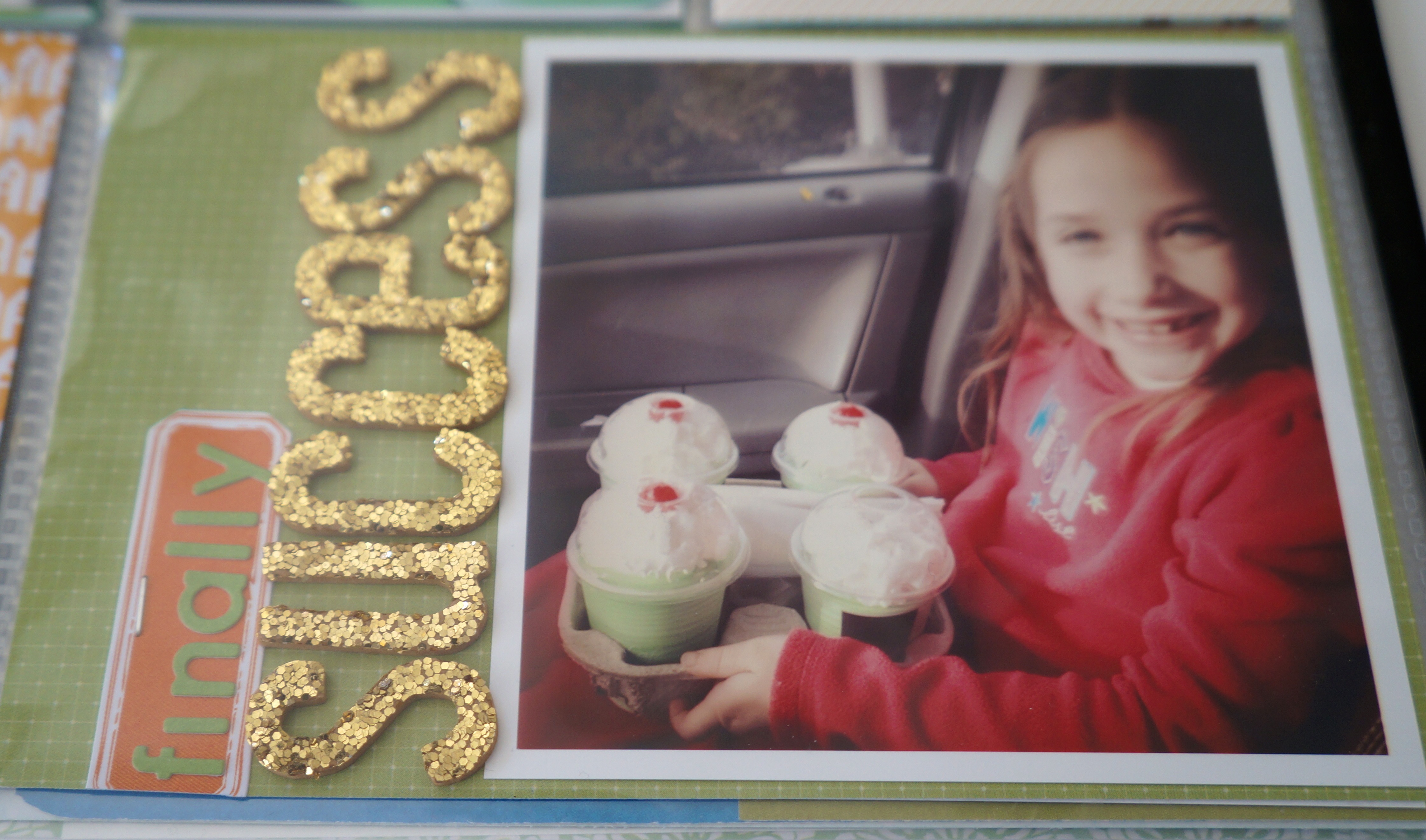
My first project was some snapshots I had of my daughters first ballet class. I knew when I saw the TuTu trim in the kit that these photos would work perfectly. The layout came together surprisingly quick! The background paper was not pink at all, it had a slight mint distressing around the edge. I took some distress ink in a rose shade to make it fit just a little better. I used glue strips to adhere and pleat the tutu trim and I altered the gray sticker letters slightly by outlining them and then using a glitter pen to give some sparkle. The journaling is inside the cute little bag.

Taegan's First Ballet Class-1

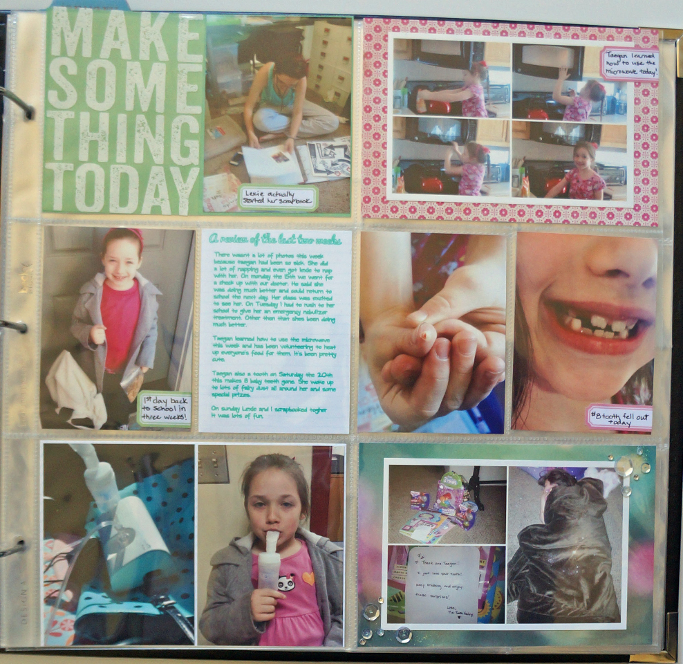
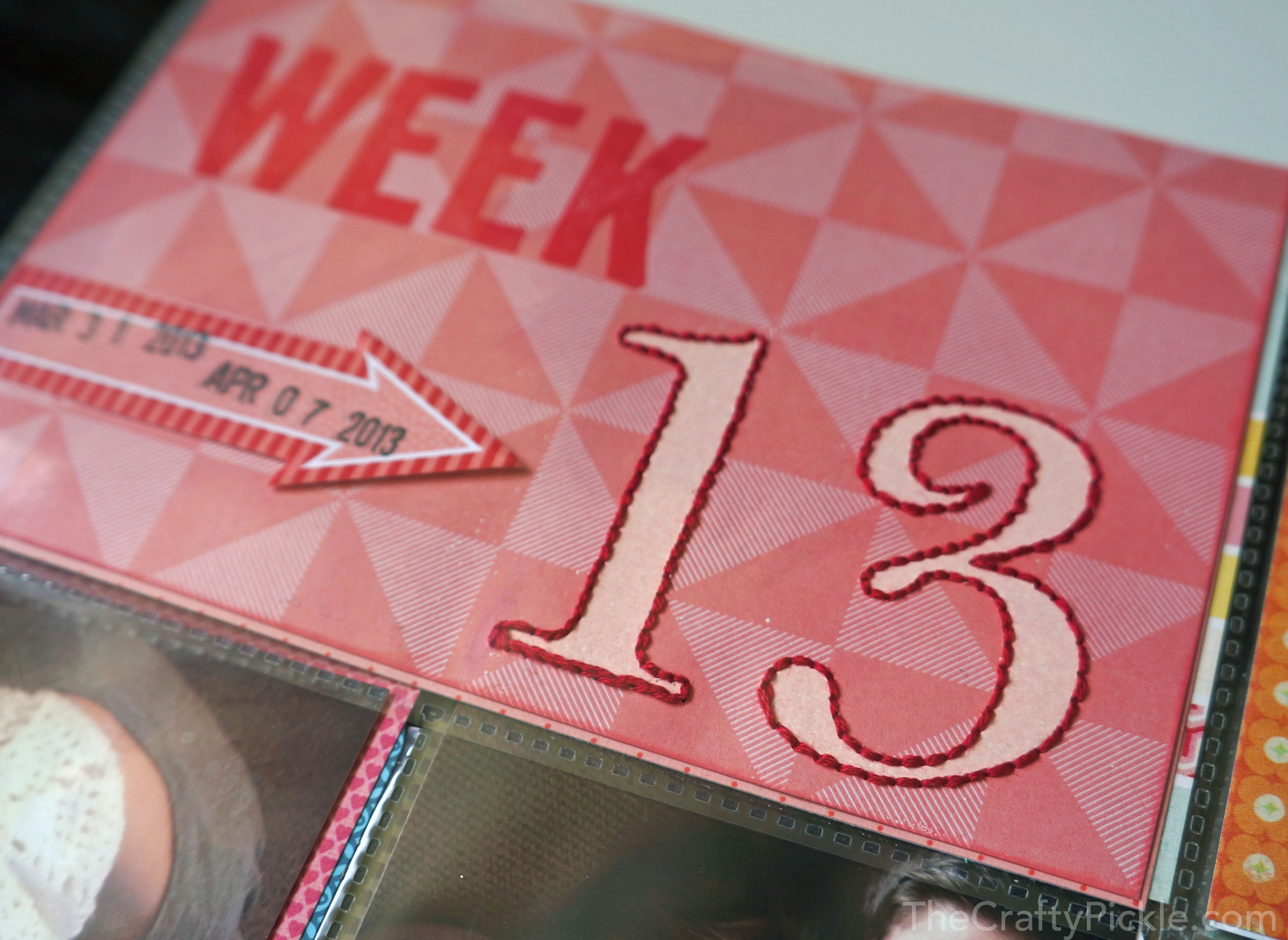
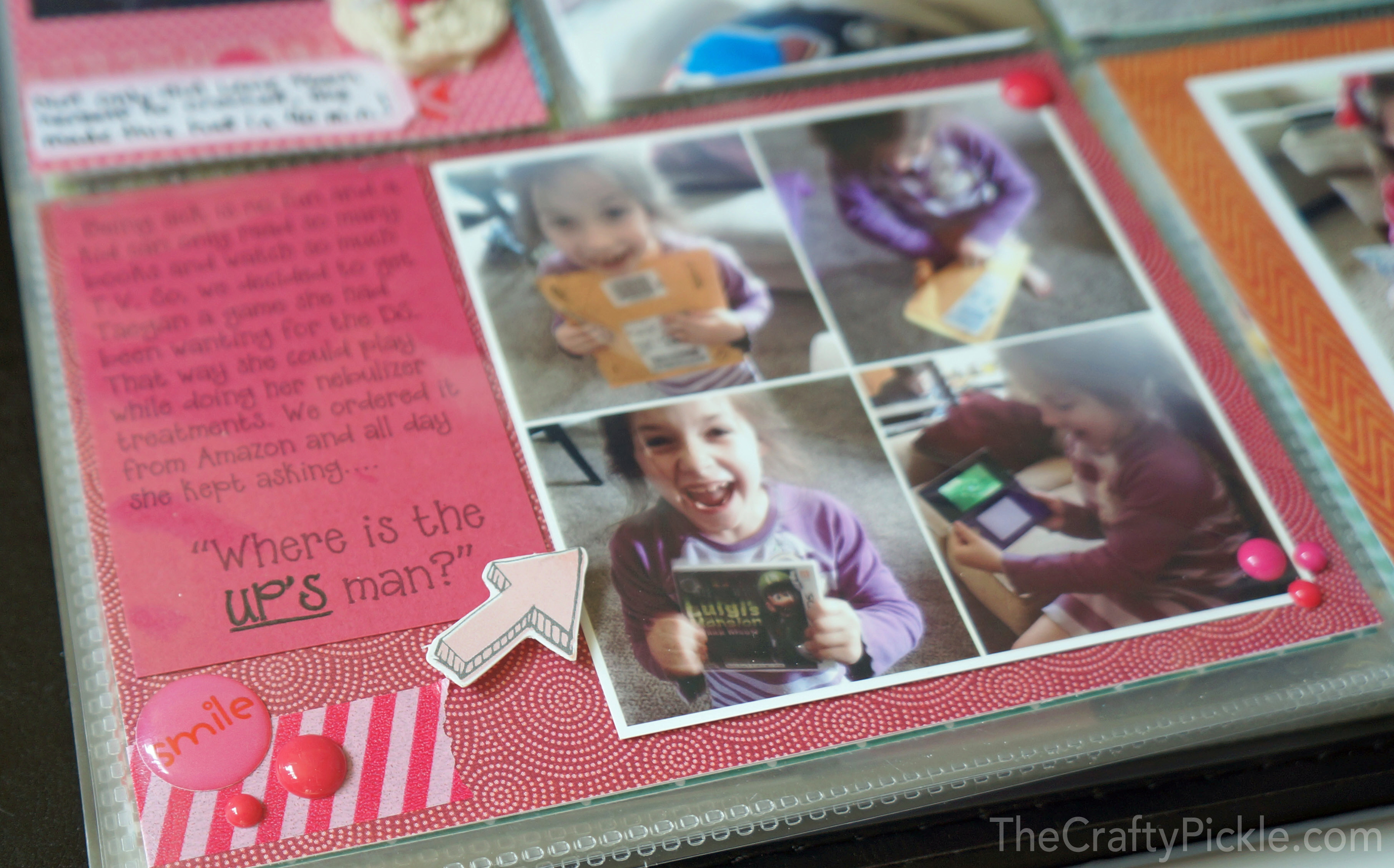
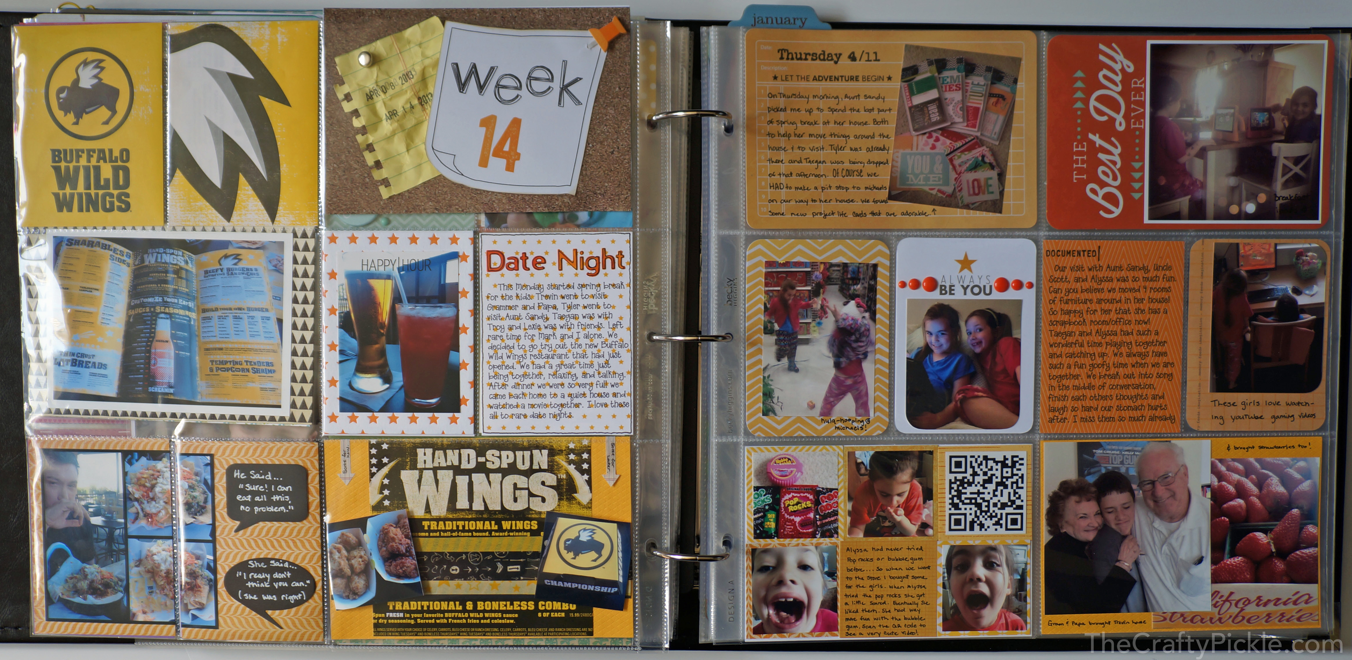
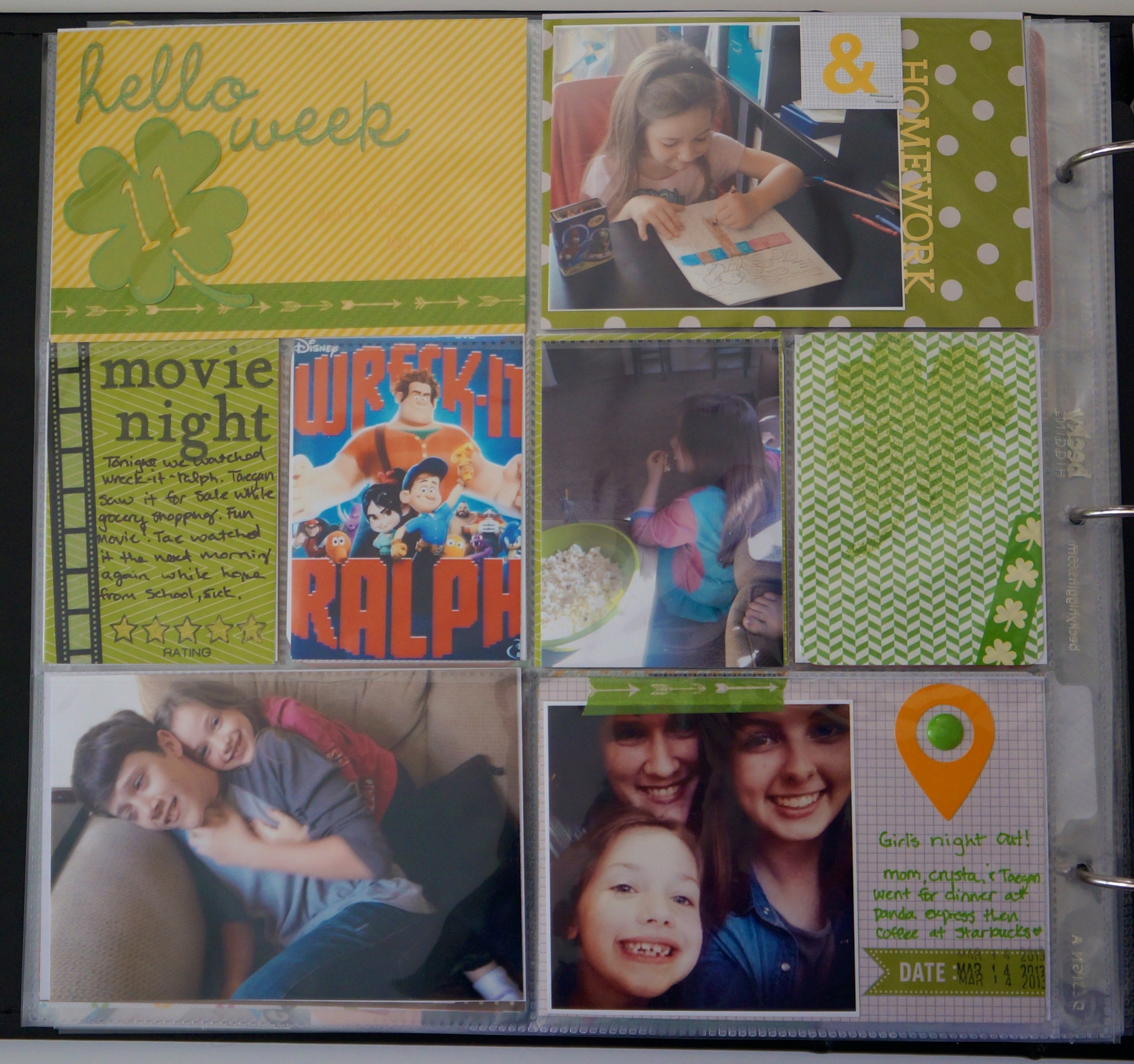
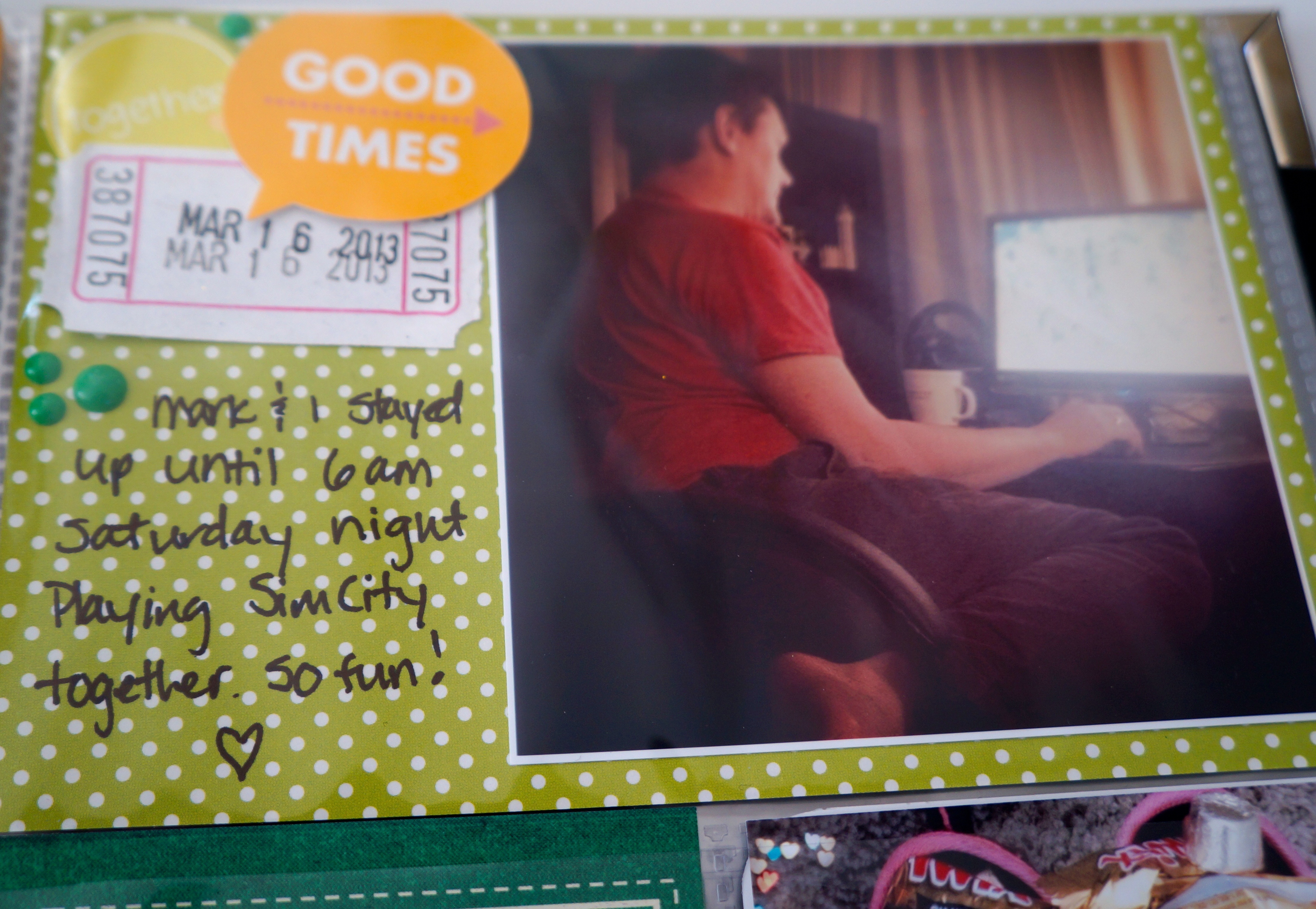
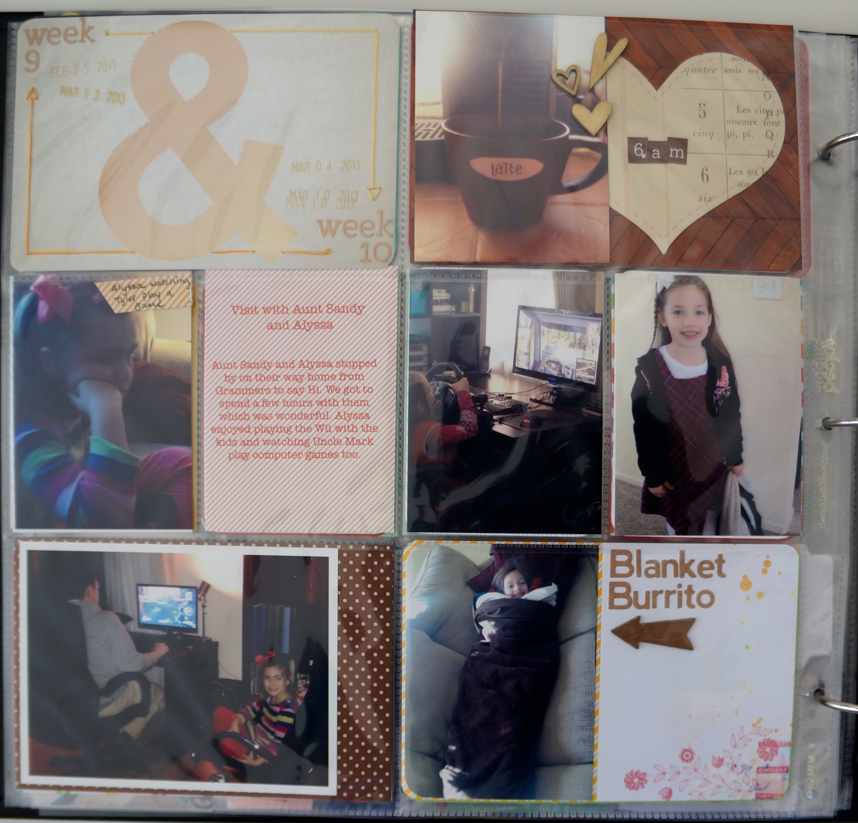
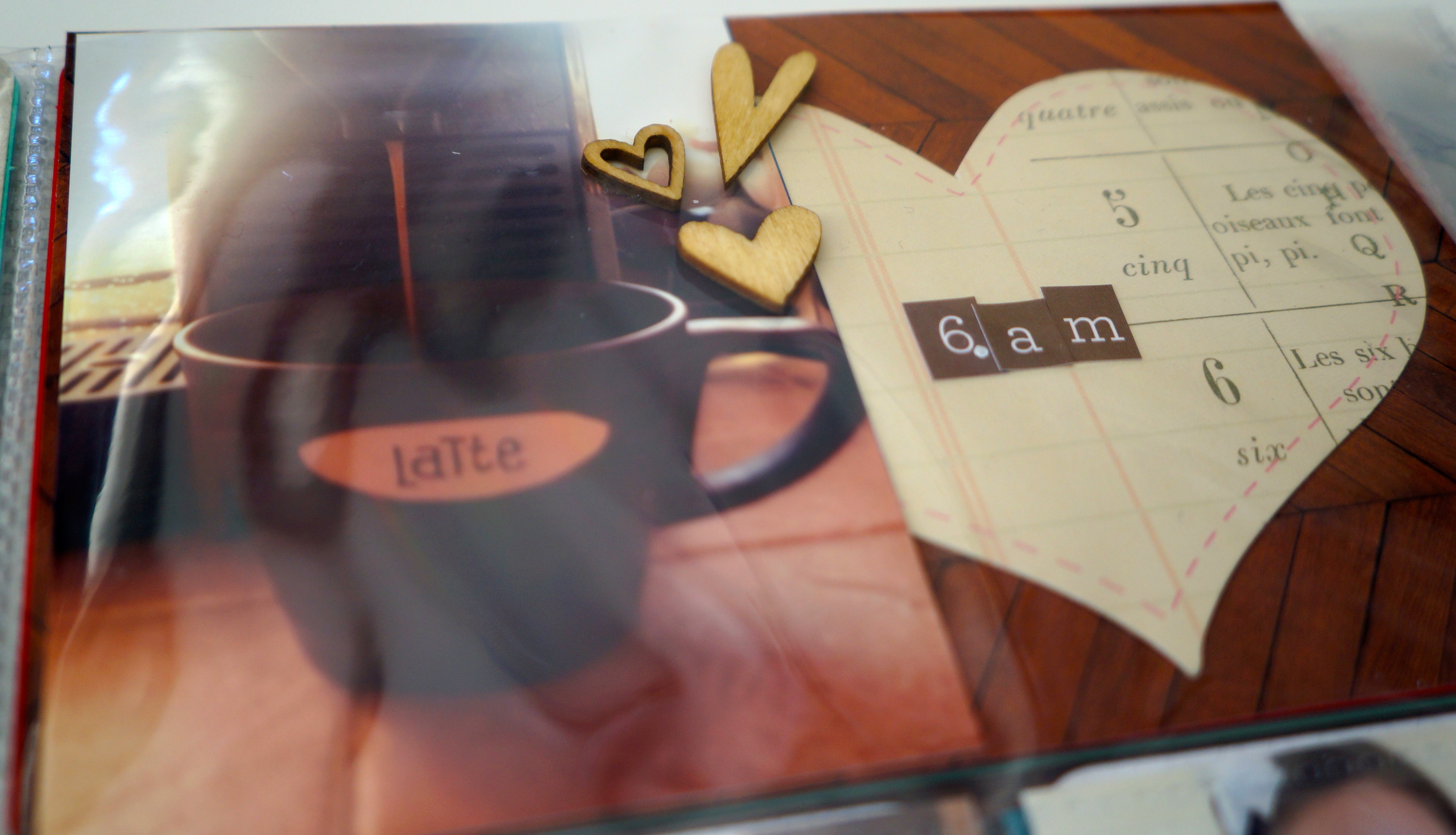
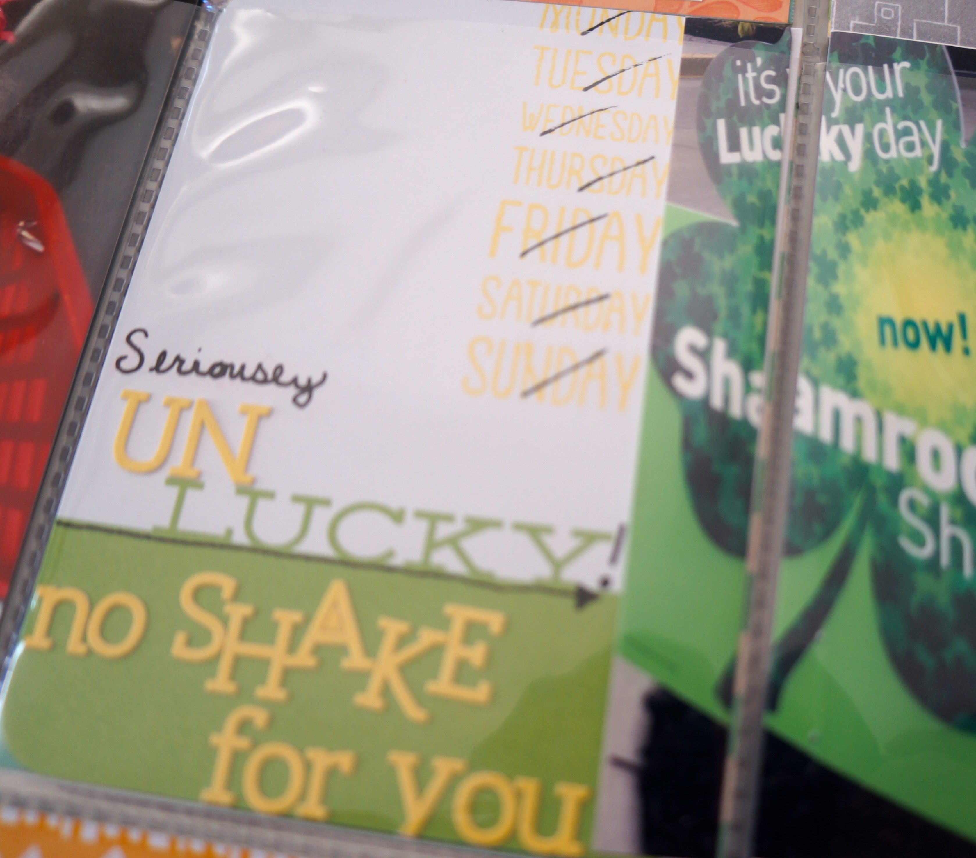
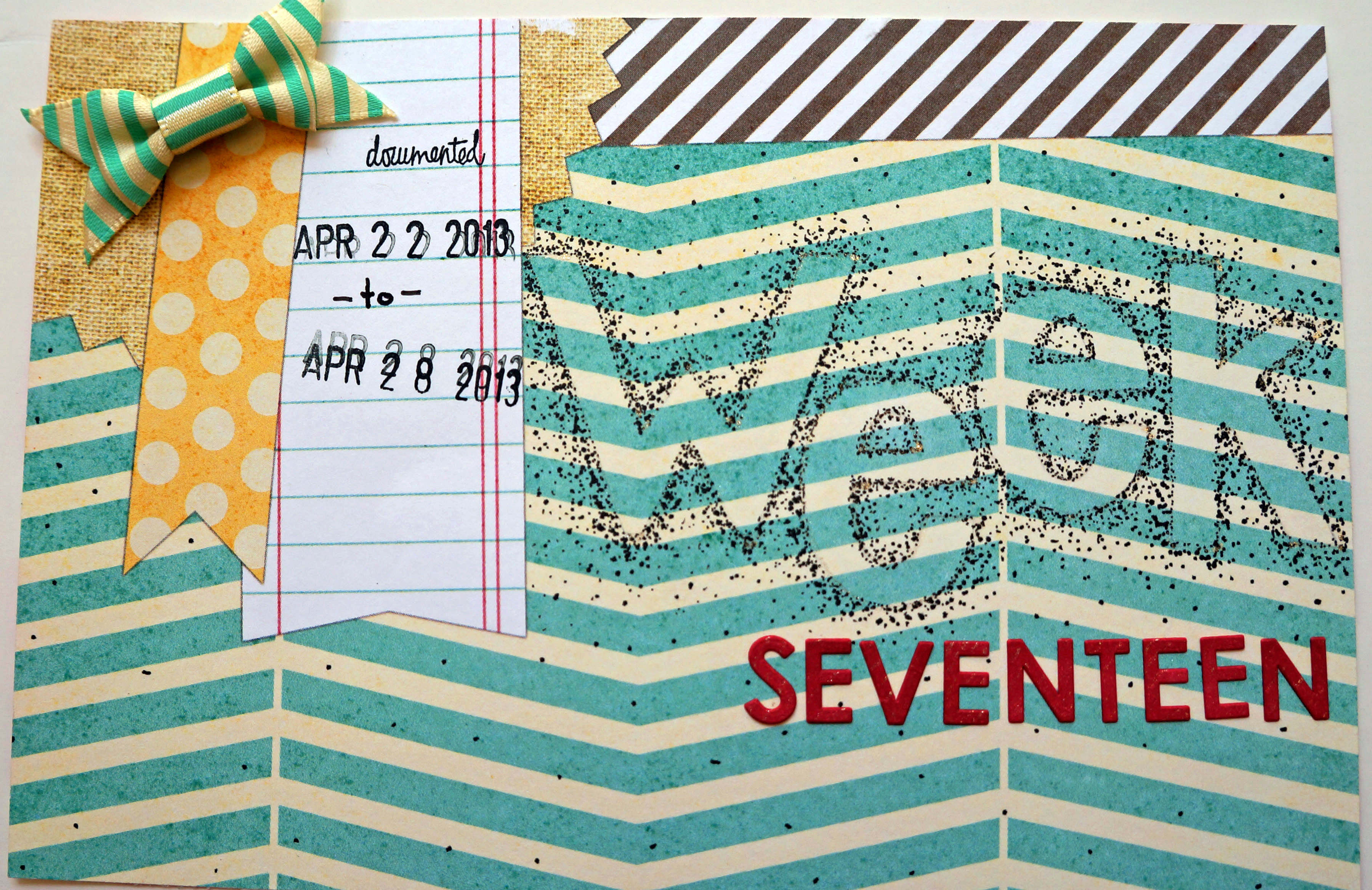
For my second project I tackled my week 17 photos for my project life album. The colors in the photos matched pretty well with the colors in the kit. For my title card I used the 12×12 sheet of paper included from Elle Studio. The top left corner had the layering look that I thought was ideal for a title card. I took a pencil and my old school lettering templates and lightly traced the letters for week. I then erased the lines so that I could barely see them and took my black journal pens in three different sizes and started dotting everything outside the letter. I spread the dots more and more as I moved away from the letter. The “seventeen” was white sticker letters from basic gray that I colored with a copic marker.

TItle card week 17 thecraftypickle.com

All of the larger letter stickers are the gray ones that were included in the kit, and the small letter stickers were the white that I added in. I altered the color as I needed to with my copics or another alcohol based marker. The tab stickers were perfect for little bits of journaling here and there. Proof that one can complete a project life layout with normal sized scrapbooking supplies.

week 17-1weel 17 left TheCraftyPickle.comweek 17 right side TheCraftyPickle.com

Now remember when I said I wanted to complete one card as well as the layout and project life spread? I thought that I would be making a card with the last little bits of the kit but it turned out that I had so much more to work with still. I created 4 cards! I am not much of a card maker so this was big for me. All cards that I made I put on white cardstock card bases.

Card assortment TheCraftyPickle.com

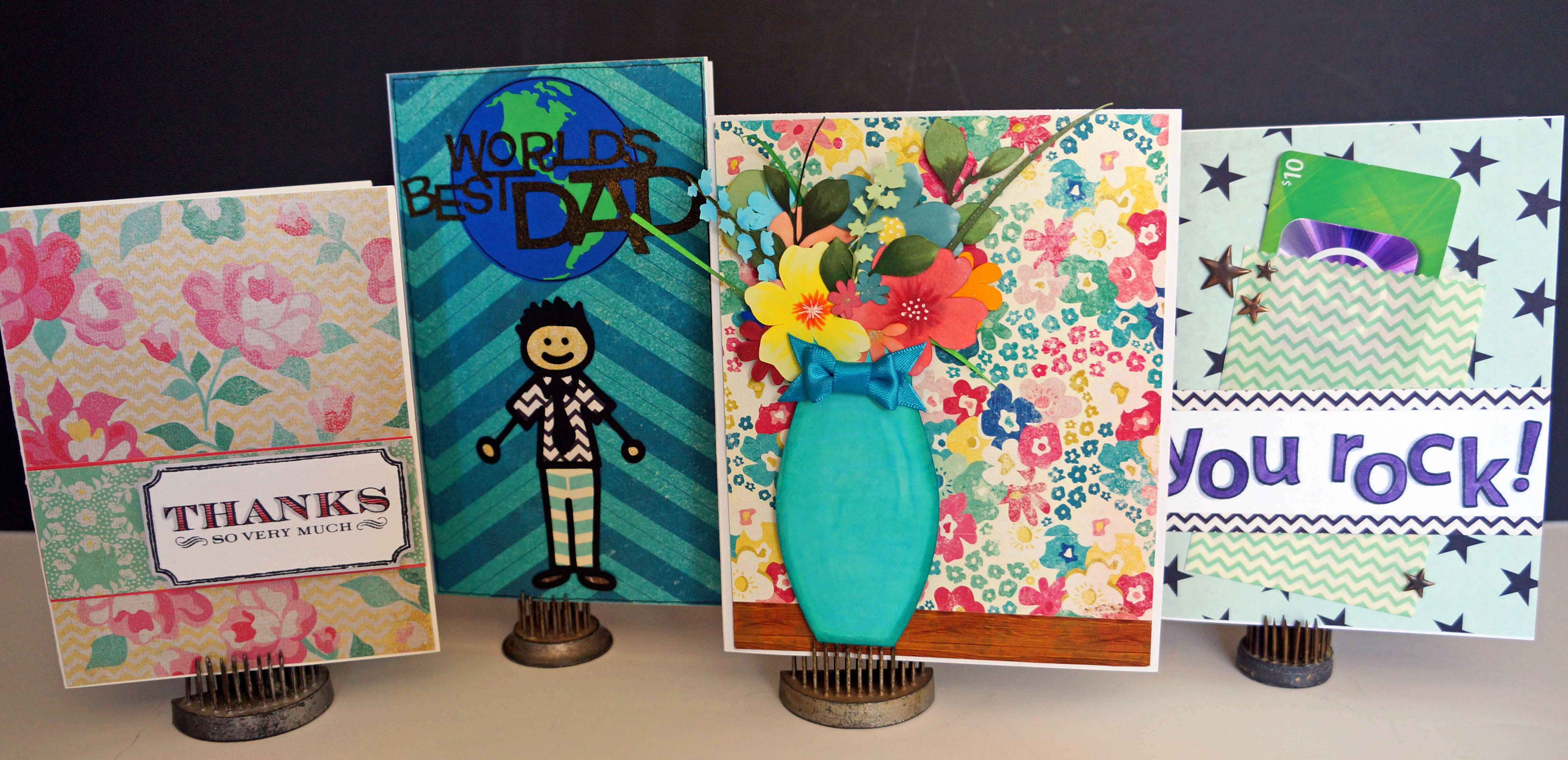
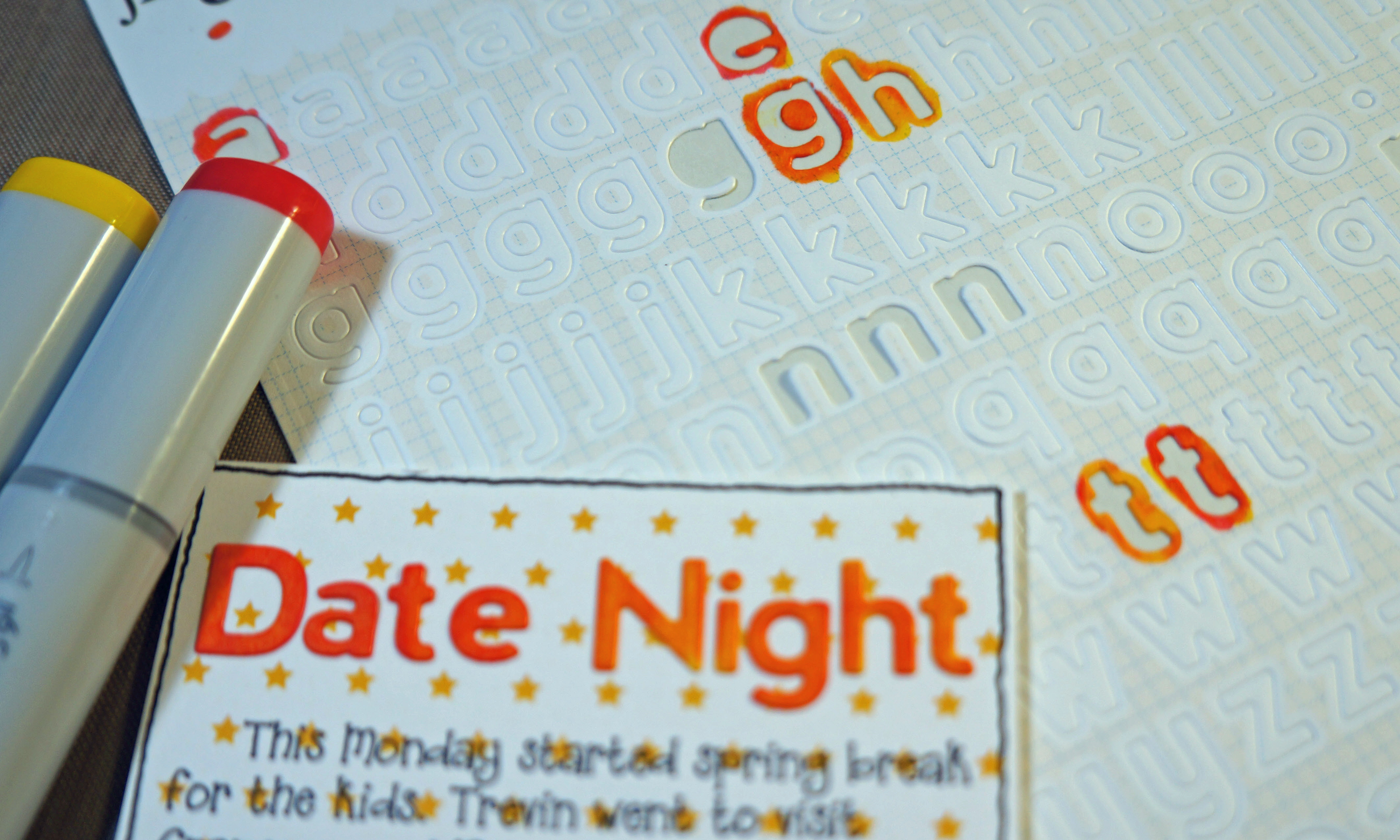
My first card is simple and sweet. A nice little thank you using three pieces of the paper included in the kit. I colored in my stamped image with a copic and then cut it out of the white cardstock. I attached it using pop dots to give it a bit of dimension.

Thank you card-TheCraftyPickle.com

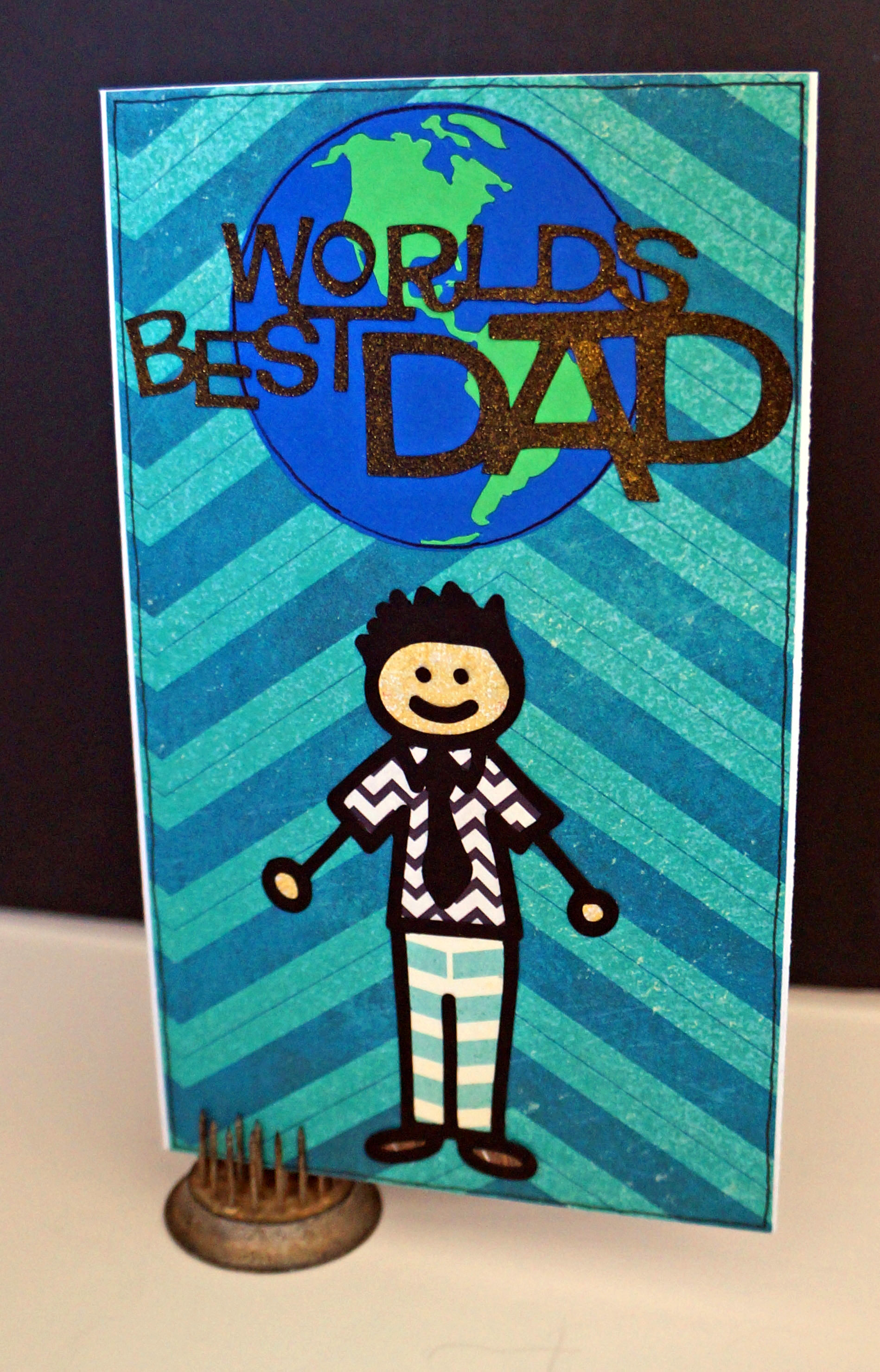
My second card is father’s day inspired!I loved the green & blue print of the background and thought it fit a more masculine card. I used my silhouette for the title, the world, and the dad image outline. Notice his clothing? Yep, all little scrap pieces of paper that were in the kit and nothing else. was like coloring with paper and the end result is a fun whimsical card for Dad.

Best Dad Card-TheCraftyPickle.com

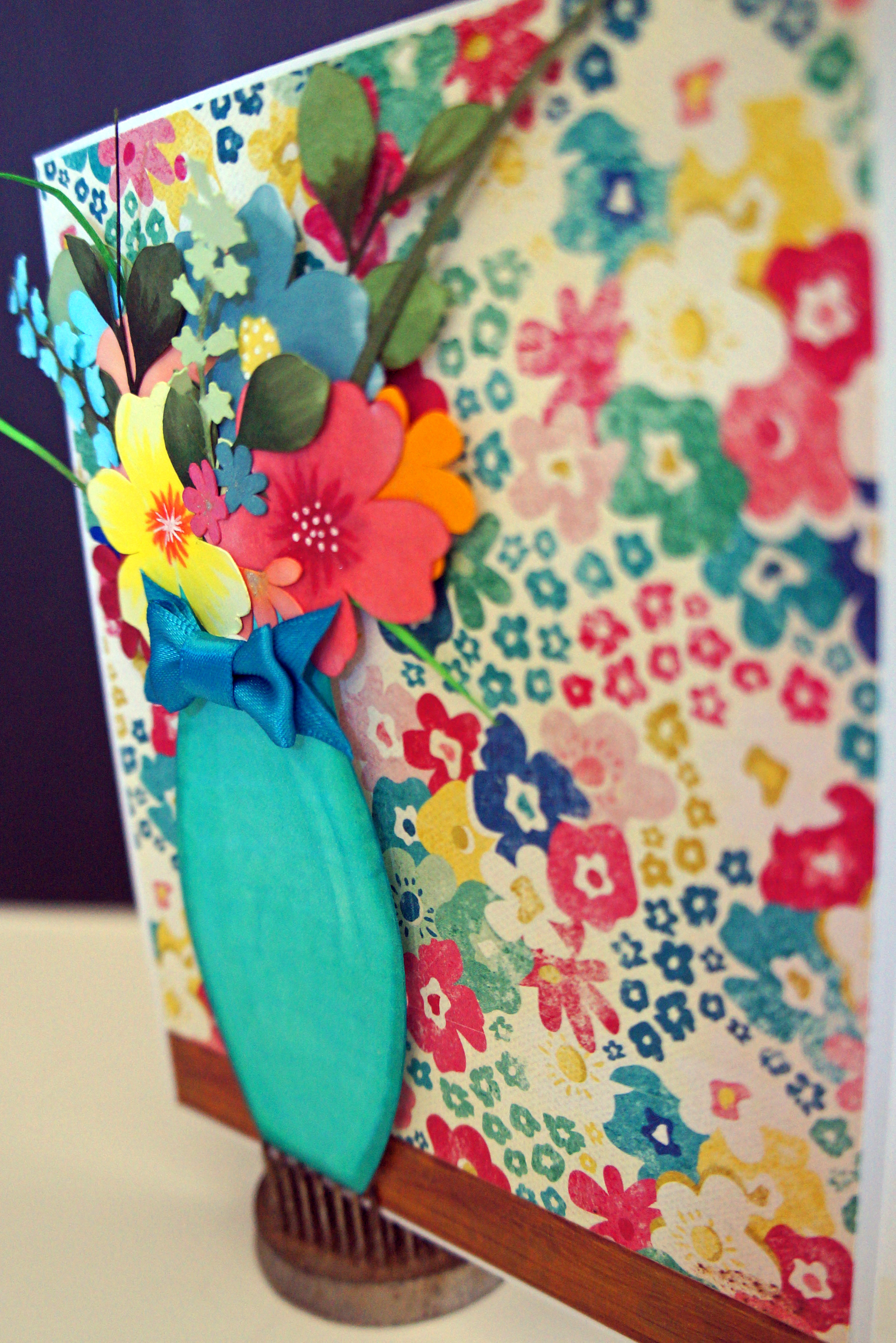
My third card was inspired by the floral paper, the pattern almost made me think of wallpaper. I popped some woodgrain washi on the bottom to mimic a table and cut out a vase and some flowers (all out of white cardstock) with my silhouette. I then went in with copic markers in complimentary colors as the background and colored in the different elements then I built my paper floral arrangement to the back of the vase die cut. The bow embellishment was the perfect touch and I added pop dots to the back of the flowers and vase. This card would be great for a birthday, thank you, mothers day, get well, or a “just because” card.

Floral side view-TheCraftyPickle.comFloral arangement card-TheCraftyPickle.com

By my 4th card I was starting to have less to play with so keeping things simple I made this card with a scrap of the star print paper and one of the little paper bags I had still. I stamped “You Rock” on white cardstock and colored in with a purple copic. I shaded using a gray copic and then bordered the white with some of the black zig zag patterned paper I still had. Added a few of those adorable little metal stars to tie in the star theme and popped in a iTunes gift card. This would make a good birthday, graduation, or other gift type of card.

you rock gift card-TheCraftyPickle.com

You know what else? I STILL had more supplies left. I cut all remaining paper down to 3×4 and or 4×6 to use in future project life layouts. I also integrated the few embellishments I had left over in their proper spot in my scrapbook room. Mission complete!

This is the first kit that I have used start to finish and I have to say that it was simple, fun and has changed how I will continue to scrapbook. Kits are a fabulous way to go if you get overwhelmed by all sorts of supplies like me. Joining a monthly kit club like Scrapbook Circle is a great way to keep up on the latest trends, However if that is not in your budget right now, consider putting together some kits of your own from supplies you already have on hand. How do you begin to put together your own kit? Check out this video by Glitter Girl on 2peas in a bucket. This has to be one of my most favorite videos she has done. She even has a PDF to assist you further. I have already began to assemble some of my older supplies into my own kits.You can also look at past kits that appeal to you of various kit clubs and try to copy them as close as you can. If you are a paper crafter on the go, this is perfect for when you are packing up for crop night!

I hope you enjoyed my start to finish with this kit. Don’t forget to stop by Toni’s blog HERE to see more ways you can use this kit. Here is a little sneak peek of what you will see 😉

image1 (3)

Toni's layout 1

Feedback from friends!

20130515-003020.jpg

Today I would love to hear from YOU! A blog is not much of a blog without its readers, and I want to provide content you want to see and read. With that being said, I created a little poll that I would love if you would participate in. Additionally if you have an idea that is not apart of this poll and you would like to see featured on TheCraftyPickle.com then please leave a comment below.

Thank you so much for your imput and as always…

Happy Crafting!

*** Poll is closed, thanks for those that participated, Looks like this Pickle will be workin on some techy tutorials! stay tuned!***

Project life week 15&16

Hi Project lifers!

I just finished my week 15 and 16 a couple of days ago. I didn’t have a lot of photos for these two weeks because my daughter was sick. I decided to just do a two page spread for both weeks and call it complete!

week 15 16 Project life. TheCraftyPickle.com

A little bit of random things thrown in here and there for this spread. Here is a close up of the left side:

week 15/16 left side TheCraftypickle.com

And here is the right side:

week 15 16 right side TheCraftyPickle.com

I think the title card was most fun for me. I took watercolor paper and ran it though my silhouette cameo with the black sketch pen for the title. Then I took some water colors and just brushed around the edge in layers until I was happy with the overall look. I really wanted my title to pop and have dimension but I didn’t want to overdo it either. I took a set of close to my heart alcohol markers (similar to copics but not refillable) in the color Jasper (includes one light and one dark shade) I colored in the title, the lighter shade on top and darker on the bottom to give it a bit of an ombre look. I liked how it came out but it didn’t feel finished to me, so I took a cool gray copic sketch marker and marked the shadow of where the letters would be. I was surprised how doing so little popped the title so much. I am really glad I got over my fear of using these awesome markers! Another little thing I learned while working on this title card, was that my white water based sharpie marker works GREAT at covering little mistakes! I accidently stamped the wrong date (by the #16) so I marked over it once, let it dry, and did it again, let it dry and it was great to stamp again.

PL Title card for combo week spread. Watercolor and copics.

Later this week I will be posting some non-project life layouts that I was able to work on over the weekend and maybe a card project or two!

Till then…. Happy Crafting!

Project life, Facebook style!

Hi Friends!

Just a quick little post today before things get crazy in the afternoon here, as they always do. If you are a member of facebook there are a BUNCH of scrapbooking groups out there that are full of inspiration and sweet people that share the same passion for storytelling though their albums.

You can always do a search for groups using the terms “scrapbooking” or “project life”

Two of the groups I am in that are very active are

Project life 2013

and for my other hobby, Organizing my supplies LOL, there is this group:

Scrapbook/Craft Organization Ideas

 
Hope this helps add a little inspiration and fun to your day!

Happy Crafting

Stretch your supplies: Letter stickers.

What If I told you that you never had to buy colored letter stickers again? You would think I was crazy and continue to load up on a rainbow of colors, right? Well, while I was scrapbooking this weekend I realized that the only sticker letters I really ever needed to buy was white and black, and even black is optional.

I was looking for small orange letter stickers for a project life card title, and I was really frustrated when I couldn’t find any that was the right kinda orange. Then it dawned on me… why couldn’t I take white sticker letters and color them with my markers? So I gave it a whirl and it turned out perfect! For the letters below I used Jillibean soup: Alphabeans, I have also used the Basic Gray: micro letters on another layout and they turned out the same.

DSC02116_edited-1

I used an orange and a yellow copic marker. I didn’t want them to be a flat orange but kinda blended looking. I also wanted one word darker than the other. I just colored right on the sticker sheet, easy peasy!

DSC02120_edited-1

I loved how they turned out only I thought it needed just a little more pop for this particular journal card, so I took a thin black pen and outlined the letters so they would be just a little more defined and stand out from the card. (see photo below)

DSC02123_edited-1

Now, you don’t have to use Copic markers for this. I am positive you can use your water based markers although they might not blend as well. If you do not own any copics or do not want to invest in copics what I would recommend is buying THIS bic permanent marker set. The colors are lovely and with the alcohol base it won’t leave streaks. You could even blend a ombre look to your letters by layering the same color or different colors if you wanted. The Bic markers come in 8, 12, 24 and 36 pens per set. You can also use sharpies, CTMH alcohol based markers, promarkers, etc… the bonus is you will have markers on hand to use for other projects. You won’t have to worry if you have the right color letters to match your layout. Just buy a bunch of white letter stickers in the font you love. Or mix up fonts and make them all the same color.

*Edited to include a sample of different markers*

20130507-091057.jpg

Giveaway Time!!!!

Bic Mark it markers

I haven’t had a giveaway in a while and I would love to put these fun markers into the hands of some lucky papercrafter. Here is what you need to do to win.

1. Become a follower of this blog if you aren’t already (little gray button on the lower right hand side)

2. Leave a comment with your name and location. If you have any tips on how you stretch your crafting supplies I would love to hear that too.

3. Stop back by this Saturday May 11th when I will post the winner.
Good Luck and Happy Crafting!

Project Life Week 13 and 14: Feeling a little bit colorful.

Happy National Papercrafting month!

This Saturday was National Scrapbook Day and I was fortunate enough to get a couple of weeks done in my project life album thanks to my sweet husband who kept all our kids busy.

WEEK 13:

I had in my head that I wanted to create a rainbow layout for my week thirteen. I had been thinking about it for a couple of weeks. When I went to print my photos I realized that I was going to need to put in an insert of some sort as I didn’t have quite enough room. I am pretty happy with how the monochromatic rainbow look came out.

Week 13-1DSC02125_edited-2

DSC02126_edited-3

for the first page and half of the insert I did redish pink though lime green. For the Title card I used letter stickers by Amy Tangerine and I stamped and embossed the number 13. I felt it needed a bit more pop after embossing so I hand stitched around the numbers.

DSC02127_edited-2

DSC02128_edited-1DSC02129_edited-2

The second half was aqua though purple. I found that I was seriously lacking purple paper so I took some purple cardstock and stamped a cute arrow background with white ink. (every piece of patterned paper used in this week was all different, 19 different patterns!)

DSC02151_edited-1

DSC02130_edited-1DSC02153_edited-1

I was excited that I got to use my latest fab find, a cursive typewriter! I used it to make the “Father & Daughter” Tag.

DSC02131_edited-2

WEEK 14:

For week 14 I didn’t have a ton of photos. My husband and I went out to dinner one night and I took a “to-go” menu when we left. I incorporated a lot of that into my layout, which made it more fun.

DSC02134_edited-2

DSC02157_edited-2DSC02136_edited-2

For the title card, I used a piece of cork paper. I pierced a hole and stuck part of a Doodlebug pushpin though a post-it-note type paper. The post-it was a sketch from the Silhouette online store as well as the letters. I LOVE using the sketch pens on the silhouette. I then took a piece of yellow lined scrapbook paper I had in my stash, used a notebook style border punch along the side and then crumpled the piece into a ball. I flattened it out and stamped the dates. I used a large silver brad to mimic the look of a thumb tack.

DSC02138_edited-2

DSC02140_edited-2

I used some basic gray and studio calico stamps for the title part of the card above and *gasp* my own writing. I am still having a hard time with journaling in my own writing and not using the computer all the time. However, I know my children will more than likely want to see moms writing over computer font’s in the future.

For the card below I edited a photo that didn’t come out so great but still wanted to use. I used a bokeh filter which made it look a little more dreamy. It worked out beings it was breakfast for the girls and light was spilling in from the window behind them (with both on their ipads no less LOL)DSC02141_edited-2

This next card was so FUN! I incorporated a QR code into the page so that it can be scanned and go to a video on YouTube of my niece chewing gum for the first time. Pretty funny stuff. No journaling could do that one justice. I see myself using these QR codes more often!

DSC02139_edited-2

Whew! That’s all the photos I have for you today. I feel really good that I got a bit more caught up. I was also able to do a couple of cards and some pages in my December Daily album. It was a very busy yet productive weekend! I hope you all enjoyed your National Scrapbooking Day as well, no matter how you spent the day.

Happy Crafting!

Project Life Week 11 (St. Patricks Day week)

I am chugging right along, well slightly “behind” but not too much that I feel overwhelmed. Currently I am working on week 13 and a mini project as well that I am hoping to share this week but for today, week 11, St. Pattys week!

week 11 1week 11 leftweek 11 right


It was a fairly normal, not much going on week so I picked a few things to spotlight that could really of fit in any week.

For my title card I did a few cuts on the Silhouette and kept it fairly simple. I stamped the dates in gold. I did add some glitter pen accents. My favorite glitter pens of all time are the Sakura Stardust Gelly Roll pens. I usually have several of the clear star pens on hand as I use that one the most. It is perfect for adding a little (or a lot) of sparkle in just the right spot. If you haven’t checked out jetpens.com take some time out to peek at the wonderful pens they have. They offer pretty good pricing and fast shipping. I have always had awesome luck with them

week 11 title


Did I mention I love washi tape? 🙂 I included a little on this weeks layout and my favorite had to be the movie night card. The flim strip worked out perfectly.

I have been doing more and more cluster embellishing as well. I love the dimension it adds but not a ton of bulk. all of the stuff I layered was flat except the enamel dots…. Oh how I love those adorable enamel dots!

week 11 cluster


For an afternoon date my husband and I got pedicures. Was a nice treat beings that sandal weather is upon us again. I stamped “his” and “hers” in gold but I embossed the word pedicures in gold directly on my photo. I think it came out just right. If you do this you want to make sure that you are moving your heat gun around quickly as to not burn your photo.

For our little St. Pattys Day tradition the kids leave their shoes out the night before the 17th and the leprechaun comes and leaves treats in their shoes. This year Taegan got different kinds of gold wrapped candy and some gold $1 coins. She was a very happy girl!

week 11 leprecaun loot


Because I didn’t have a ton of photos I did add in a few things to fill in the spots. A homework photo of my daughter doing her normal homework routine. A photo of a popular show that my middle son and I watch together faithfully, and a week in review which I don’t do often. I think that is always great to have some photos or ideas of things that you can fill in the gaps for those weeks when you are just a few photos shy of a two page layout.

Hope you are all enjoying your weekend!

Happy Crafting!

A Simple idea to help with Project Life.

I know there are a lot of free digital templates out there for Becky Higgins Project Life page protectors, I love those for scribbling notes in. However, I found that when I sat down with my photos for the week, I start by sorting my photos in my album on top of the page protector because I need to move them around and visually see how they will fit. Moving the album on and off my desk got real annoying so I tried just having the page protector out in the open to pop down on my desk to stay until I finished arranging and embellishing. This worked out far better! I only had a problem of the page protectors sliding around everywhere because I wanted one of each of the plastics out to decide which to use.

So here is what I did to solve my problem, its such a simple idea I had to share! I took those page protectors (one of every design, A-J) and slipped in a solid color piece of cardstock (you could even slip in grid or plain cards if you wanted), I put the corresponding letter in the upper left hand corner with some old sticker numbers I had and hooked them all on a large binder ring. I keep this on a hook that is on my Raskog cart from Ikea that way I can easily grab it and decide what design I want to use.

photo (1)photo (2)photo

Super simple right? It made a big difference for me though and now I am branching out to add more PP styles and inserts in my album. Maybe this little tip will help you too!

Happy Crafting!

And the organization continues…

Here I am again, sharing my organization for the little things now. I have been sorting, purging, organizing my scrap space. It seems like a never ending job. My order from Close To My Heart finally came in though and I was armed with new organizational supplies to get things together! My goal this last couple of months is to really streamline my supplies to have them take up as little space as possible beings I am working with a limited space in my Loft right off the master bedroom. You have seen my boxes from CTMH holding my project life cards, my 6×6 paper pads, and my washi collection…… ahhh washi, I love you so! So without further ado let me share my wood veneer and sequins storage!

This is my before photo how I sorted my ever growing wood veneer collection. It started with an embroidery floss box and then added a container I found at the dollar spot at Target. Not a bad storage idea I was just running out of room, they felt really squished, and  I was just got happy how it looked.

For more info visit www.thecraftypickle.com


And here is my after. I was able to fit a few different designs per box as they hold quite a bit, I put like items together. I still have some growing room for more as well.

For more info visit www.thecraftypickle.com


What you see here is the Close To My Heart Small organizer, The foam insert, and 4 sets of the craft boxes to go inside.  I love how I can take out the box I want to work with and not have the entire thing on my desk.

For more info visit www.thecraftypickle.com


Adorable right? So then once I completed this I thought of other things I could organize in the same fashion…. Buttons, Brads, Little die cuts, Flair, a little mix of everything in one box to carry ALL your embellishments. Of course I only had one more case and my sequins collection has started to get out of hand so you can guess what I did…

For more info visit www.thecraftypickle.com


For more info visit www.thecraftypickle.com or www.thecraftypickle.ctmh.com


Same exact idea with the wood veneer. Now I only have to take the box that I will be working with to my table instead of having all of them out. I have all different sizes of sequins in the same box as it is so easy to poke around and find the one I want.

As soon as I get all of my supplies in order and my scrap space the way I want it, I will definitely do a little tour. I hope this helps you with ideas to sort your supplies. You can purchase all the CTMH container supplies I have shown today and in the past posts from your local consultant or directly from my website here. If you have any questions about the storage I used here or any of my other storage solutions please let me know. I am happy to help in any way I can, *** I am no longer an active CTMH consultant but keeping things at a hobbyist level. If I can help you get supplies you need just let me know.***

Happy Crafting!

Project life week 9 and 10

So I didn’t have a lot of photos for either weeks 9 or 10 so I thought I would just combine the two weeks into one spread. I think it came together pretty well. I anticipate that this might happen again though the year. Its nice to know I don’t have to try to cram in a bunch of extra stuff to fill up a two page spread just for the sake of doing a two page spread every week.

week 9:10 full

week 9:10 left sideweek 9:10 right side


For the title card I got the idea from an instagram photo I saw using this studio calico “&” card. I went to try and find it again and I couldn’t so If someone knows who had used this same idea please let me know so I can give proper credit.  I loved the look and thought it would be perfect for a two week title card. I used similar colored embroidery floss to do the arrow stitching. I stamped the dates in gold ink and used the little yellow stickers from studio calico for the week 9 and week 10 title.

week 9:10 title card


I am one of those girls who needs her cup of coffee first thing in the morning before anything else. Once my alarm goes off I go straight to the coffee maker and then wake the kids. I wanted to stay simple with my photo and figured no journaling was needed beyond “6am”. I love these little wood veneer hearts from Studio Calico and Freckled Fawn (I pulled hearts from the two different packs I had).

week 9:10 latte love


So this week we had quite the shake ordeal. We ended up having to go to McDonalds several days (and more than one McDonalds as well) just to get my little girl her shamrock shake she had been wanting so much. It was pretty funny when you think about it but the frustration that we went though in the process was NOT fun!

unlucky close up journaling close up week 9:10 shake success


So there is my week 9 and 10. I am starting to feel better being more caught up. I figure I will always be a couple of weeks behind but thats ok, thats caught up enough for me. It’s when I get more than a month behind that I start feeling more pressure and stress.

I hope you all have a fantastic weekend!

Happy Crafting!